Handling device orientation
Hello Friends,
Welcome Back to "Web Ingredients". If you guys are new to my Site please do check my previous articles as well.
Guys, as we all use devices like smartphone, iPad or any Tablet for browsing any web page which is kind of easy job, but what kind of script is running on background or written for handling that web page design to make it responsive throughout the devices and desktop is hidden.
Actually, to make that possible, most of the credit goes to CSS (cascading style sheet) for turning even a simple page into the responsive page.
Today, I am going to show "How to handle web design while orientation".
For detecting the device is orientation via CSS, "Media Query" is used.
I am going to explain about Media Query in my next blog article. For now let's check, how to implement it.
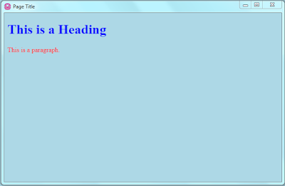
For Landscape Orientation:-
OutPut:
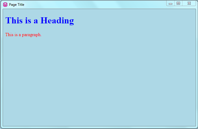
For Portrait Orientation:-
OutPut:

Guys, as we all use devices like smartphone, iPad or any Tablet for browsing any web page which is kind of easy job, but what kind of script is running on background or written for handling that web page design to make it responsive throughout the devices and desktop is hidden.
Actually, to make that possible, most of the credit goes to CSS (cascading style sheet) for turning even a simple page into the responsive page.
Note: "Responsive Design" means, a web page created in such a way that it will automatically adjust and let the use of web layouts, images with media queries to become flexible enough to change the layout accordingly for mobile device and desktop.
Today, I am going to show "How to handle web design while orientation".
 |
| Responsive Screen with flexible Page |
For detecting the device is orientation via CSS, "Media Query" is used.
Note: "Media Query" is a CSS style technique introduced in CSS3. It uses the @media rule to include a block of CSS properties.
I am going to explain about Media Query in my next blog article. For now let's check, how to implement it.
For Landscape Orientation:-
OutPut:
For Portrait Orientation:-
OutPut:

So guys, as you can see, I am not only changing the Background color but also I am playing with a color attribute of H1 and P tag whiling rotating the device.
Full Code:
If you guys have any questions about any of the UI components, Please do Leave a comment below..!!
&&
If you like this article don’t forget to share it.
Till then "Happy Coding".


Comments
Post a Comment